The Doctors both husband & wife are well-known Neo Netologist and Pediatricians of Dahod practicing over 2 years. These doctors had a dream to design the 14 beds Children hospital in Gandhinagar that is simple, sober, timeless, and unique without eliminating any of the requirements.
Project Name: Shree Narnarayan Children Hospital in Gandhinagar
Architecture Firm: Prashant Parmar Architect | Shayona Consultants
Principal & Founder Architect: Architect Prashant Parmar
Website: www.prashantparmar.com
Firm Location: Ahmedabad, Gujarat, India
Completion Year: 2023
Carpet Area: 4,000 sq. ft.
Budget: INR 4000 / Sq. ft. Approx.
Project Commencement Date: 29/09/2022
Project Completion Date: 24/08/2023
Time Duration: 11 Months
Project Location: Gandhinagar, Gujarat, India.
Photo credits: @studio_16mm
Additional Credits : Design Team: Ar. Hemang Mistry, Ar. Ashish Rathod, Ar. Vasavi Mehta, Ar. Nidhi Patel, Ar. Nensi Patel, Ar. Mansi, Ar. Arpit M., Ar. Ruchit S.

Once you step into this uniquely designed children hospital, a soothing, timeless, and calming vibes can be experienced that can heal the patients in its own way. For making the interiors elegant & timeless, soothing combinations of browns and grey colors are used here.
Initially, the space consisted of 4 adjacent shops. But, considering the client’s requirements, we have combined all the shops for designing the hospital within a small space of 4000 sq ft that too without losing the connectivity. So, we implemented the zoning aspect and designed the space strategically. Moreover, it was mandatory avoid the hindrance in flow of the outdoor & indoor patients.

Thus, Zoning helped to imbibe all the requirements of the clients which were:
- Reception Area connected with waiting and play zone for children.
- 2 OPDs
- Special & Semi Special Rooms with 10 Beds
- General Ward with 4 Beds
- A Passage separating the Private Activities with Common ones
- NICUs with Capacity of 12.
- Buffer Space
- Emergency Room
- Medical Store and Many more
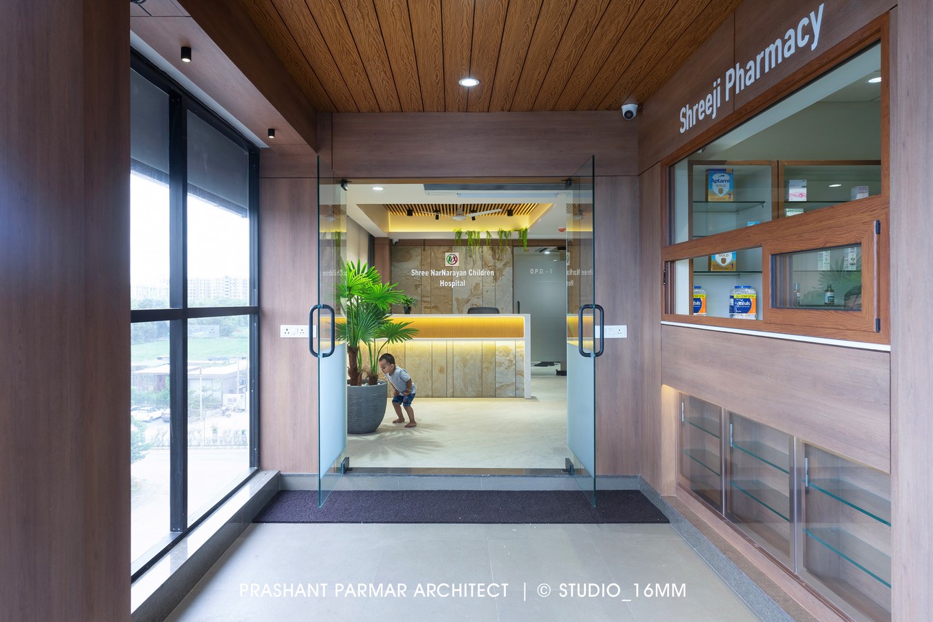
The professional persona of the client is reflected in the reception area which is designed with Luxury yet soothing interiors. The incorporation of Ganesha Temple here, creates a calming & serene ambiance. A Sanskrit Shlok “सर्वे भवन्तु सुखिनः । सर्वे सन्तु निरामयाः ।” has been embossed on Brick Cladded Wall of waiting area, offering heartfelt prayers for the patients to get well soon. An additional warmth is added in the space by the suspended metal ceiling with wooden finish powder coating. The matte finished cement greyish floor in the reception area adds a soothing contrast to the interiors.
The reception table is decorated with relwood, stone veneer, and a corian top. The raw & robust look is attained by the use of stone veneer in the backdrop.

A waiting area connected with children play zone has a capacity to accommodate atleast 15 people. We have mainly used earthen tones with a combination of browns and greys that gels with the hospital’s overall interior theme.
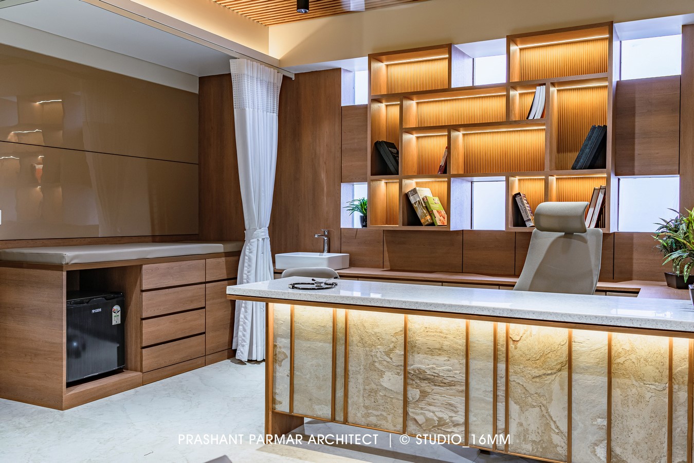
The strategic placement of OPDs visually connects all the spaces like NICU, Nursing Station, Emergency Room & Reception area as well without losing the privacy of the doctor. Initially, there were a cluster of small windows in the backdrop but we took it as an opportunity and designed the floating book shelf without enclosing the windows.
We have designed the Nursing Station in such a way that it acts as a connecting link between all the Spaces for the Doctor & Nursing Staff.
The passage is designed beautifully to separate the Private and Public Zones and maintain the privacy of the indoor patients. The continuous profile lights on the ceiling illuminates the passage and gives an endless look to the space. A soothing combination of Wooden Textured Tiles in the flooring & relwood fluted panels on the walls adds warmth & Luxury to this beautiful Corridor.
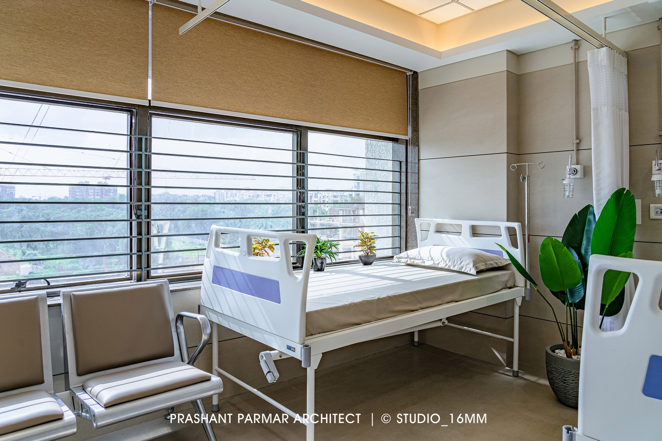
For the penetration of sufficient amount of natural light & ventilation throughout the day, the patient’s rooms are placed accordingly which gives a pleasant feel to the patients. The uniqueness of all the rooms is that the silent colors gives a spacious look and all of them are separated by wooden partition sandwiched with glass wool for acoustic purpose.

The layout of the general ward with 4 beds has been carefully planned to ensure that there is ample space for circulation, allowing both patients and medical staff to move around easily.
To cop up with the requirement of the medical store, we have positioned it in the entrance itself having the connectivity with the Reception Area which also secludes internal zones with the patient’s crowd. The door here is camouflage to give a seamless look to the backdrop of waiting area.


