OPUS is a brand specializing in purse hangers, which can be placed securely on the edge of the table to hang your purse, hence free up space at the table and on the seats, and free up your hands for more activities. OPUS Taipei is the first shop for the brand and was designed to be a multi-purpose space that can be used for meetings, product launches as well as a retail store.
Designer: Chris Chen, Director of Paradox Studio www.paradox-studio.com
Project name and location: The OPUS Shop. No. 197-1, Dan-An Rd. Taipei City, Taiwan.
Client:OPUS International www.just-opus.com
Character of space: Concept store for a purse hanger specialty retailer.
Floor area: 10.5 m2
Materials: Wood, glass
Photography:Benjamin Chou
Studio Name: Paradox Studio
Design Team: Chris Chen
Area: 10 sqm
Year: 2010
Location: Taipei
Photography Credits: Benjamin Chou
OPUS Taipei is located in the city’s fashion district. The previous use for this location was a garage and the space was converted into a small storefront during the economic recession.
The store is merely 2.3 meters wide and 4.5 meters long, which is about 10.5 square meters and is a very petite space. To overcome the size limitation of the store, we designed a perspective illusion by painting yellow color blocks (using OPUS’ signature color) on white walls to create the impression of a deeper and wider space. The rhythmic yellow blocks run along the two opposite walls of the store and converged into a horizontal line on the back wall which is highlighted with a clock custom-designed by us.
The unconventional clock is shaped like the rising sun using lines formed by OPUS purse hangers instead of numbers to indicate hours on the clock face. We used purse hangers of 4 different colors from OPUS’ classic Swarovski collection to form “zones” on the clock face, with each zone encompassing 3 hours. The four colors, blue, purple, pink, and green are arranged from cold to warm to reflect the lighting changes of the day. The clock has become a conversation piece and the star of the store and has generated lots of comments and interest.
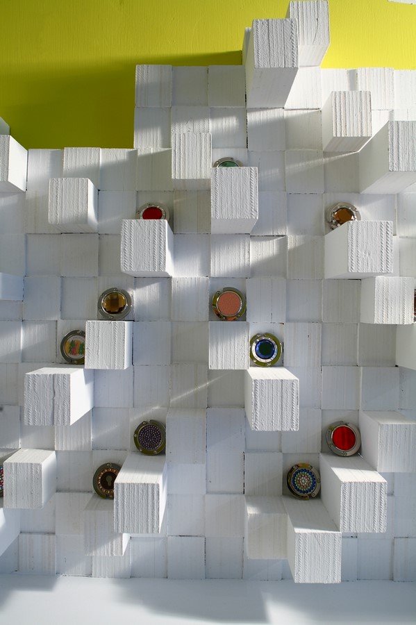
To create a clean footprint area and minimize the feeling of clutter, we keep all the display function to the walls. Timbers of 4 different lengths line the two display walls to create an up–and–down visual effect and form an exhibition canvas to present the store’s collection. Each piece of timber is designed to serve as a showcase for a single purse hanger and is thus cut and sized precisely to be just slightly bigger than the footprint of a purse hanger, so one purse hanger could be placed on top of each piece of timber and can be easily reached by a customer. The store is quite unique in that it carries only one product — the purse hangers, which come in many different colors and designs and are decorated with materials ranging from wood and leather to semi-precious stones and sparkling crystals – so we felt it was important that the store displays its complete collection of products and allows the customers to see, touch, and feel each purse hanger. These individual display stands enable such a three-dimensional product display that fully utilizes the limited amount of space and at the same time allows visitors to experience the full range of OPUS products.
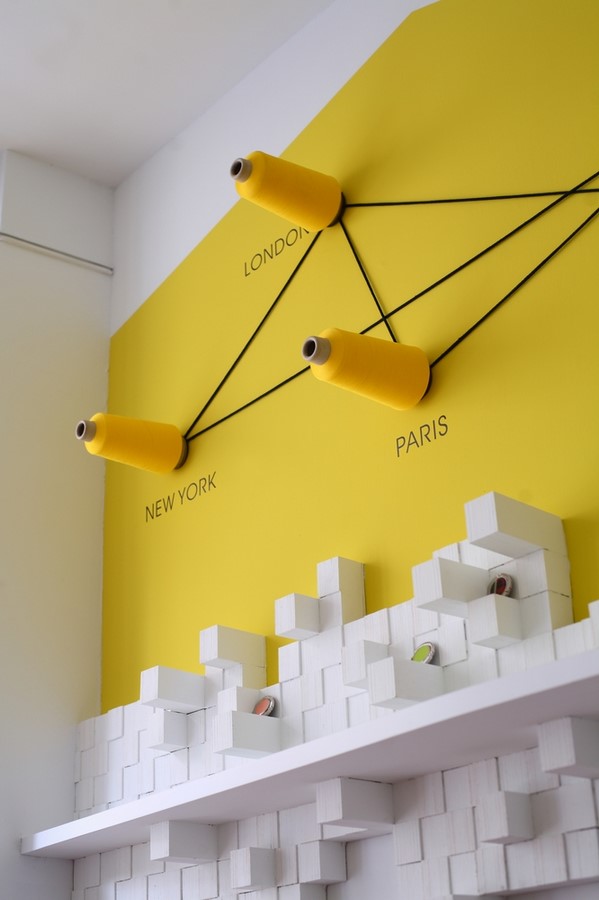
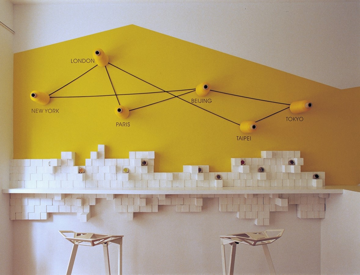
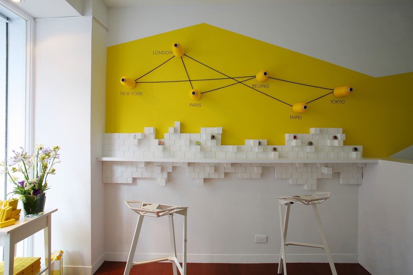
The two display walls each has a theme and are meant to serve different functions at the opposite sides of the store. When customers enter the store, the first wall they see on the right is the “Nature Wall” with its dramatic waves (created by the wood display stands) which invoke images of a natural landscape. This wall features the brand’s classic as well as seasonal collections. On the left side of the store, the “Urban Wall” has fewer timber stands and these are arranged less dramatically than its counterpart but are deliberately arranged to resemble a city skyline. Six yellow bobbins are positioned on the upper portion of wall to indicate the cities that make up OPUS’ distribution network. This wall features the limited-edition products, and high stools are placed along this wall so it resembles a bar area where OPUS proprietors can use it as a meeting space with its vendors and distributors.


