The brief given to the Architects by the Developer was to design the best commercial building of Gandhinagar. Gujarat has a unique hybrid model when it comes to ‘Commercial’ building unlike most other metro cities, where the functions are clearly distinct for ‘offices’ and ‘retail’. Most commercial buildings in Gujarat have multiple functions happening in the same building, which creates a major challenge for the designers.
Location: Kudasan, Gandhinagar
Typology: Mixed-use (Retail, office)
Site area: 1,42,222 sq ft
Super Built-up area: Apprx. 7,00,000 sq ft
Levels: G+6 Floors
Developer: Shivhari Infrastructure (Mr. Amit Patel, Mr. Nisarg Patel, Mr. Mitesh Patel)
Architects: Imbue Design (Mr. Vishal Bhavsar, Ms. Krishna Bhavsar)

Keeping in mind the client’s objective and the challenges mentioned above, the architects decided to come up with something, which would be pathbreaking as well as financially successful for the developer. Hence, the idea of ‘The Landmark’ was conceptualised based on the time-tested retail places with an open courtyard and circulation through the building, which makes it more interactive and functional. The architects believed that the building should not only be a true ‘Landmark’ in terms of the aesthetics, sales and planning but also provide equal opportunity for the ‘end users’ to do business in case of retail showrooms and corporates to enjoy the occupation in case of the offices.
To justify this unique opportunity, the architects focused on certain factors while creating the concepts.

Design foci:
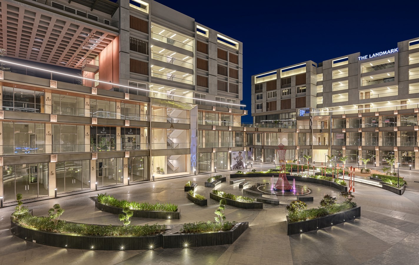
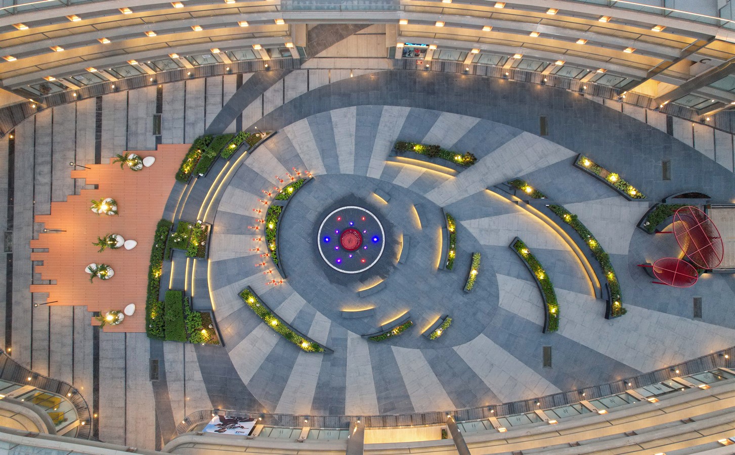
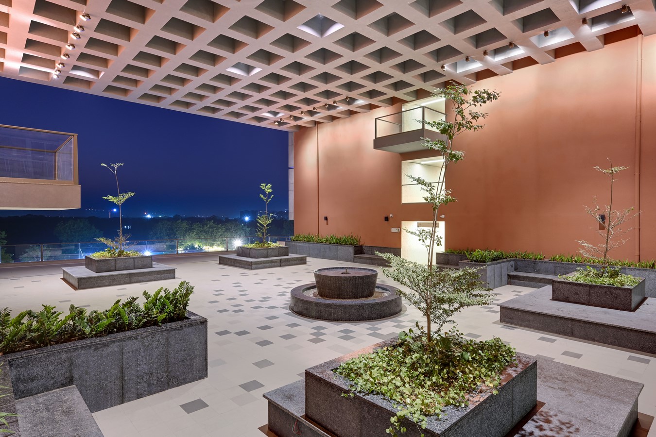
Central Open Courtyard – A central open space of approximately 1 acre was provided. Being the focal point of the building, it not only provided for ample light and ventilation but also an opportunity for public gatherings and better interaction between the building and the people. In a way it functioned like the heart of the building.
Access & Visibility – The most basic element of a good retail building is the frontage, access and visibility of each store. ‘The Landmark’, provides all these to each and every store. This was one of the primary reason for the stupendous sales it was able to generate, which no other building had ever done in the recent memory.
Elevations – The shape of the building was a free flowing curvy one. The fact that it was a corner plot, enhanced the shape even further. Unlike most buildings, the entire building had stone façade (dry cladding technique). For the entrance portals, stainless steel was used, making it an extremely upmarket and elegant building.

Spatial planning – The ‘mixed’ nature of the building meant that the architects had to give equal weightage to the retail stores as well as the offices on the top. The sizes were also arrived at based on the saleability factor. This was perhaps the most challenging aspect of the project where the sizes varied drastically based on the location. The design did have a perfect blend of small, medium and large stores.
Services – The unusual design also resulted in challenges as far as the services is concerned. ‘The Landmark’ had 8 sides, which needed to be treated as ‘elevations’. If the services (ducts, A/C outdoor units etc.) were not designed properly, it would mean that the façade would be compromised. Eventually, all the services were placed on one side and rest of the facades were free of any services. The provisions were made in such a way that even after many years the facades would not get compromised.
Success – ‘The Landmark’, is perhaps the most successful project of Gandhinagar not only for the developer but also for the end users. Apart from the design, the construction quality and the specifications are the best by the industry standards.

Conclusion:
‘The Landmark’ is the best example of a ‘perfect’ project. The unique design was equally supported by great construction. Today, ‘The Landmark’ is the home to top retail brands and corporate offices.
A project where all the stakeholders are happy, is a rarity. ‘The Landmark’, is that rare building amongst so many other buildings.


