CUN PANDA NANA: The Power of Softness and Organic Life Force
Hoormem Muscle Research Aesthetics Center, situated in Zhangzhou, Fujian, strives to create a warm and soothing oasis in the midst of the cold and harsh city. It extends a heartfelt welcome to white-collar workers, encouraging them to shed their masks and armor and reconnect with their bodies. CUN PANDA has completely revamped the brand’s vision, fashioning an aesthetic space that is gentler, more transparent, and bursting with vitality.
Project Name: Hoormem
Project Location: Fujian
Project Area: 1000㎡
Chief Designers: Cai Xuanna, Lin Jiacheng
Design Firm: CUN PANDA NANA (www.cunpanda.com)
Design Time: 2022.01
Completion Time: 2023.05
Brand Design: Chen Ziyang – SAC
Illustration Design: Chen Xiaoying
Installation Design: Knight Art Club
Lighting Design: Vidlux&Crisman
HVAC Design: YORK VRF
Material Suppliers: Youliao Selection/Bella Vista/GROHE (Zhangzhou)/Xiamen Juechuan Architectural Decoration Design Co., Ltd.
Photography: Liu Xinghao-INSPACE/Feature Vision/1988 Photography Workshop
Taking inspiration from the concept of “the softness of the body” introduced by Austrian designer and architect Horst Rittel, who once remarked, “Softness, as an expression of aesthetics, has the power to enhance our lives,” NANA has translated this notion into the spatial design.
Organic Plasticity: Softness enhances the body’s flexibility, allowing us to gracefully adapt to different environments by assuming various postures. At the Hoormem Muscle Research Aesthetics Center, this softness is evident even in the exterior facade of the space.
The airtight exterior facade sets Hoormem apart from other commercial spaces. The entire wall is adorned with expansive areas of milky white textured marble veneer, featuring arched lines that serve as golden metal openings. These not only enrich the facade’s appearance but also act as gentle guides, inviting people to explore the space.
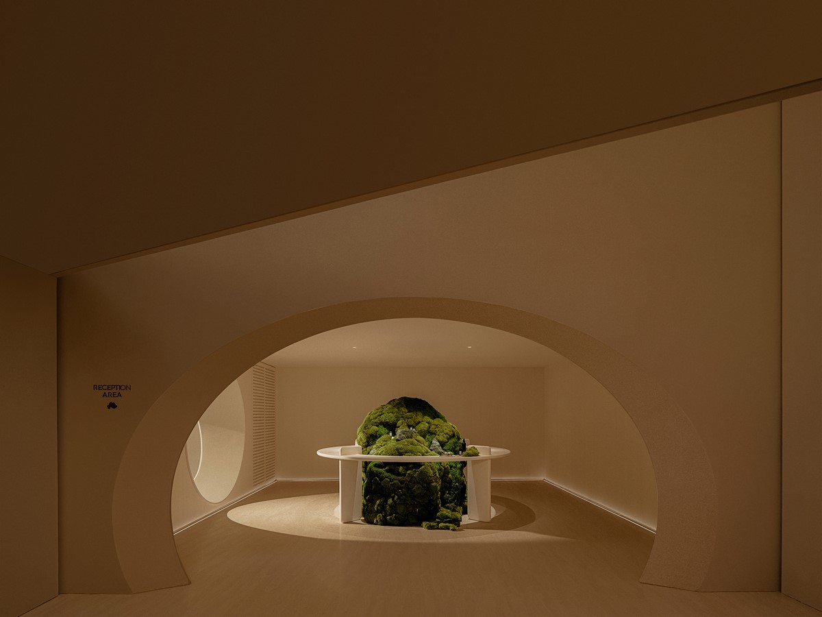
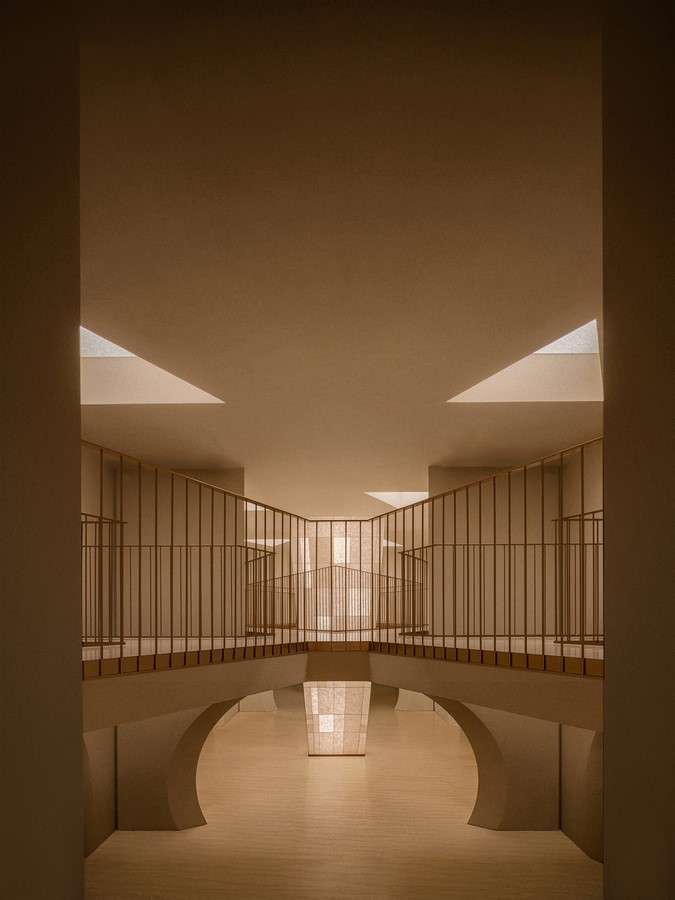
Upon entering, angular blocks fade into the background, and the eyes are treated to a delightful display of delicate curves. The openings, rounded and smooth like bubbles, organically connect different areas of the space.
Flexible Connection: The gentle sensation of hand clasping physically and spiritually connects hearts and minds, fostering tranquility and serenity.
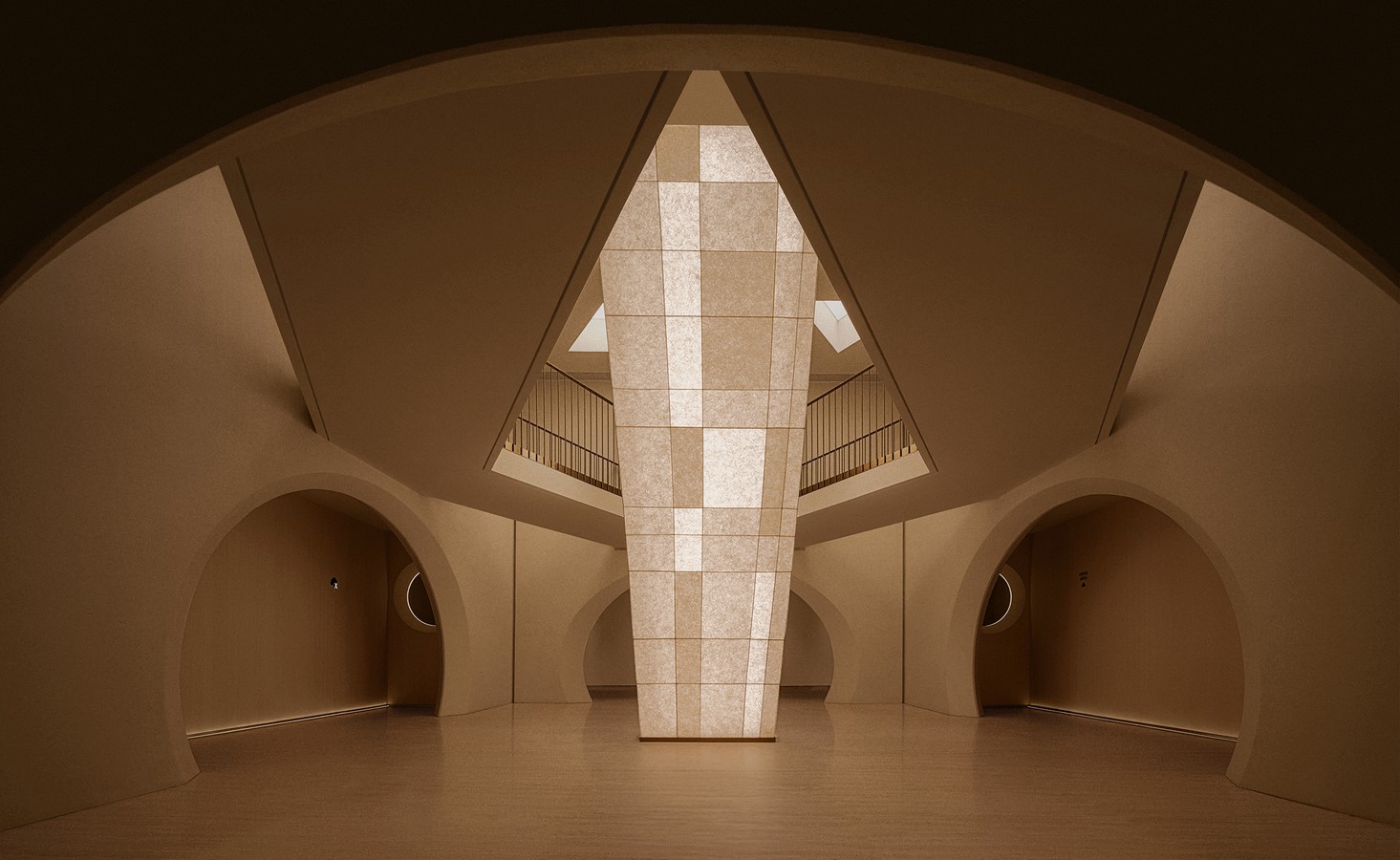
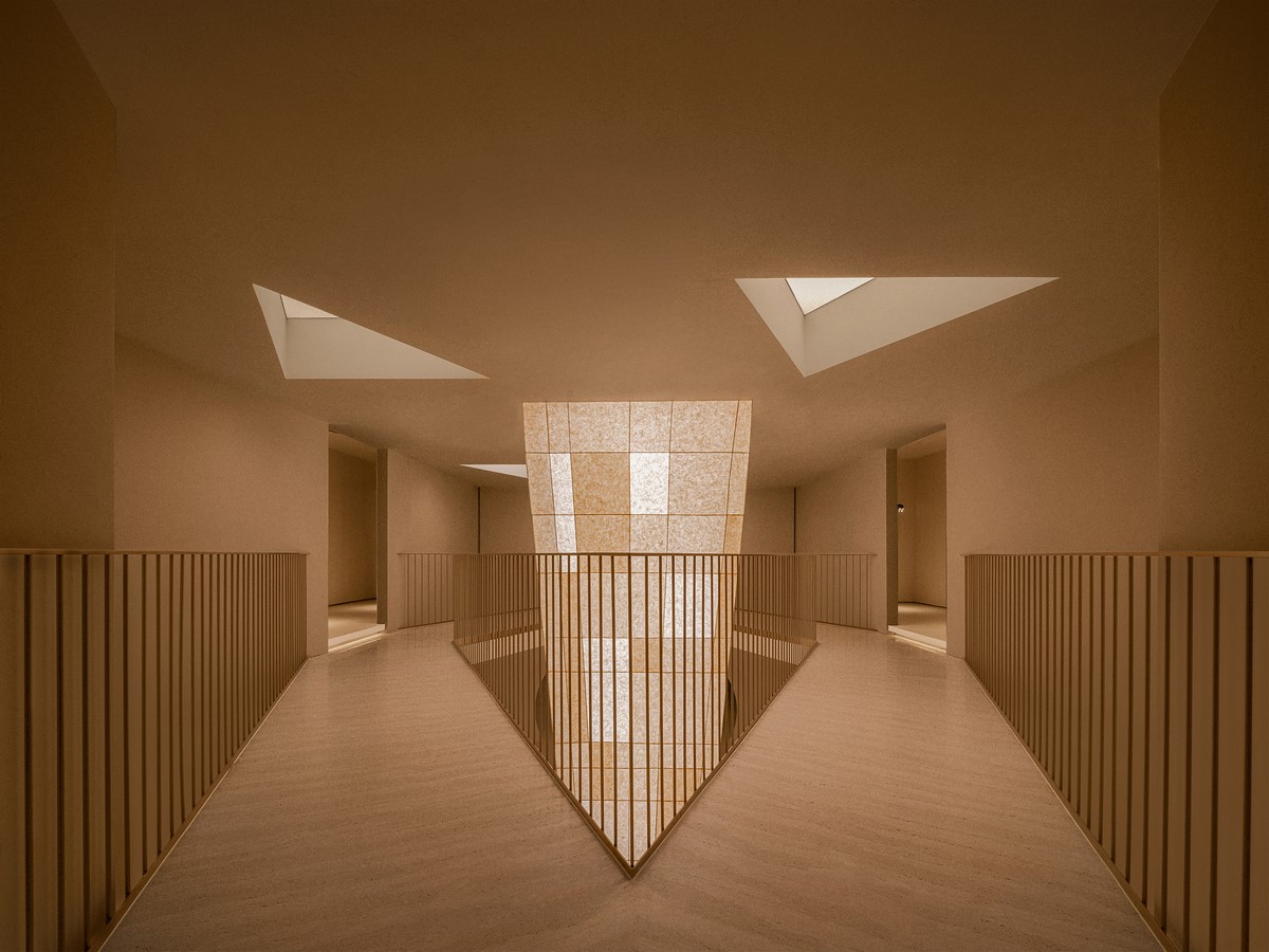
The central “symbol,” a prominent presence, spans vertically across the two levels of the space. This top-to-bottom connectivity creates a shared spatial sequence within the originally enclosed space, making people feel closer and more relaxed in their surroundings.
A soft, yellowish glow permeates through washi paper, offering a gentle visual experience and conveying a sense of ease and relaxation.
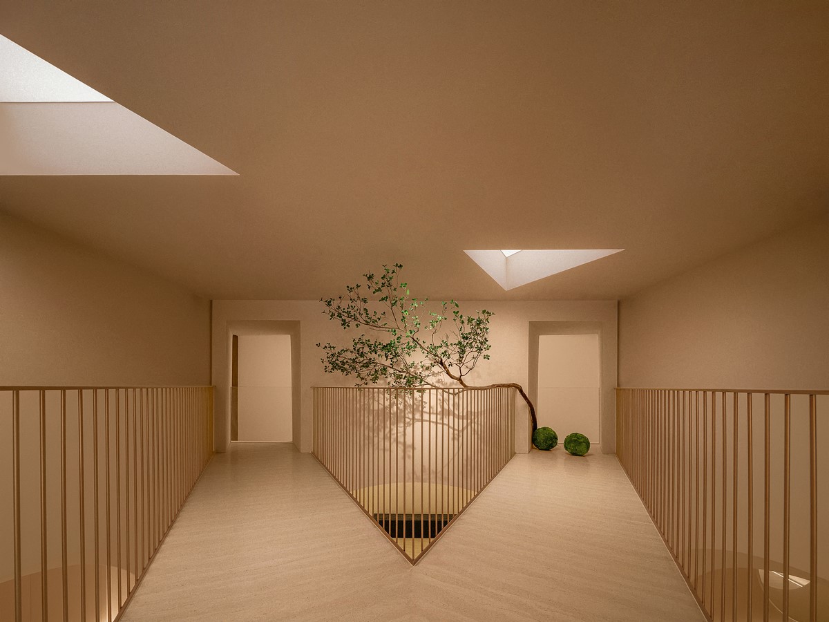
The second level stands on its own while also serving as a corridor that connects various spaces. From this vantage point, one can observe the first-level spaces from different angles, experiencing a sense of both independence and intimacy in the spatial relationship.
Organic and Soft Life Force: Softness does not equate to weakness; rather, it embodies a life force characterized by organic qualities. With its flexibility and connectivity, softness triumphs over rigid hardness and a strict sense of order, unleashing power and magnificent force. It ignites a desire for change and fuels the pursuit of beauty and innovation.
As the renowned architect Frank Owen Gehry once said, “Curves are not a lack of strength or determination, but a stunning display of strength and determination.”
NANA looks forward to embodying the brand slogan “lighten the moment for skin” through a design language rooted in the organic and natural, rather than imitating natural beauty. The aim is to create a therapeutic space with aromatic elements that help individuals awaken inner peace and beauty.
In terms of lighting design, Panda NANA follows the same transition as in the spatial design. Instead of directly illuminating specific areas, lighting gently guides people’s vision through the restrained use of ambient lighting. Lines replace focal points, outlining the contours of the space as a whole.
Two-Dimensional Visual Transformation: The brand’s visual identity is based on brand attributes and the creation of a three-dimensional space. Panda NANA seamlessly integrates “lighten the moment for skin” with the language of softness in the three-dimensional space, resulting in a successful two-dimensional visual transformation.
The word “Hoormem” adopts serifs with delicate curves or straight lines, giving the letters an artistic sense of classic and elegance. Just as light serves as an essential embellishment in the three-dimensional space, the design of Chinese characters also follows the same principle.
Both two-dimensional graphic design and three-dimensional spatial design serve as visual expressions of Hoormem. Panda NANA employs an artistic design language to convey intangible brand attributes, ultimately assisting Hoormem in presenting a more recognizable brand image and delivering greater brand value. A more recognizable brand is more likely to capture commercial attention and drive conversion.
Lighting / Function / Installation: Lighting: This is a dialogue with one’s inner self, allowing a sense of vitality and gentleness to flow into the heart. Hoormem’s display system is created by combining light, health, and art.
The arched door on the facade takes advantage of the reflection of light on the ground, enhancing the three-dimensional texture of the art coating. Six groups of eccentric circles are layered and stacked, with light circulating both inside and outside, creating a graceful and dynamic aesthetic effect.
The reception area employs low brightness and low color temperature, creating a soft and warm lighting atmosphere. In the display area, product features are highlighted with focused illumination.
The ground floor is adorned with light columns. Its dual-color temperature light is programmed to change gradually from cold to warm over time, symbolizing the brand’s theme of renewal and layering. The size of the pillar base varies, with translucent internal frameworks. Each layer must be consistent with the size of the pillar to ensure uniform brightness.
The triangular soft film skylights on the ceiling elevate the installation’s height, allowing the light to disperse fully and evenly before merging and reaching the ground, resembling a gentle ray of sunlight filtered through a sheer curtain.
The ambient lighting of the water curtain wall by the staircase changes with various colors, affecting emotions and psychology differently. The water curtain area is illuminated with modulated orange lights, resembling the glow of sunrise. Visually, the contrast between the overused gray and the bright orange colors invites customers to pause and linger.
Multiple low, medium, and high-level light strips are strategically used in the spa rooms to avoid glare from direct lighting. The walls’ texture is designed to redistribute light through diffused reflection. The rooms are equipped with a wireless smart system that allows for customized programming of welcome, treatment, shower, and cleaning modes, catering to various needs.
The lighting design of the disinfection room prioritizes health. At night, a blue light disinfection mode can be activated while maintaining normal color temperature and brightness.
Indeed, optimizing functionality, creating an atmosphere, and introducing visual differentiation are all aspects that brands should carefully consider.
Function: Installation: Healing Begins with the Five Senses
Smell: We perceive scents from foods, flowers, and our surroundings by detecting odor molecules in the air through our noses. Smell has a profound influence on memory and emotional experiences.
Taste: We experience flavors—sourness, sweetness, bitterness, saltiness, and umami—by perceiving food chemicals in our mouths. Smell not only enables us to savor cuisine but also serves as a protective mechanism to determine the safety of food.
Moss Installation Location: Side area of the lobby
The vibrant atmosphere of the enormous moss installation, resembling an oasis, evokes a sense of closeness to nature. It provides visual pleasure while also focusing on sensory stimulation. The gentle touch of the moss, coupled with its mysterious fragrance, creates a symphony of smell and taste. The interplay of light and shadow allows customers to indulge in a comprehensive sensory experience, as if they are immersed in a mysterious and enchanting world of greenery.
Vision: We perceive the shapes, colors, and sizes of objects by observing the reflection and refraction of light. Vision is one of our primary modes of perception and the most direct way we perceive the world.
Light Island Location: Center of the lobby
Light activates all five senses within a space. The Light Island serves as a beacon, guiding people away from the hustle and bustle of the city and into their inner selves. It leads every visitor through the noise and stress, helping them find tranquility and healing.
“Light Island” employs a gradient breathing light rhythm, mimicking a gentle breath and allowing people to experience natural rhythms. The exterior of the light columns is covered in softly textured washi paper, and warm light gradually ascends from the base of the columns, evoking a sense of tranquility. The soothing changes in light and shadow have the power to heal the soul. Here, people can sit or lie down, close their eyes, and fully experience the healing effects of the “healing light.” Accompanied by healing music synchronized with the rhythm of the breathing lights, individuals are transported to a realm of tranquility.
An Ethereal Mirror Location: Waterfall wall
This concept draws inspiration from the enchanting beauty of flowing water. The material-infused mirror exhibits a flowing luster. The interplay of light and shadow infuses vitality into the space, while skillful lighting enhances the sense of mystery within the installation. The ethereal atmosphere invites customers into a heavenly wonderland.
The white noise of flowing water creates a harmonious and serene atmosphere, allowing customers to immerse themselves in the therapy and forget the city’s hustle and bustle.
A Forest for Healing Location: SPA rooms
The curved mountains and tranquil forest evoke a sense of innate connection to nature. Inspired by nature and integrated into the “natural” aesthetics, these elements are artistically expressed through abstract natural curves at the entrance of the healing space. It’s as if visitors are entering a secluded path where Zen rooms and lush flora reside. The entrance to the forest is partially concealed, guiding visitors to experience an ambiance that helps them forget their worries and annoyances.
Touch: We feel temperature, texture, and pressure by touching objects. Touch is one of the primary ways we interact and communicate with the world.
Turning Stone into Gold by Touch Location: The bar at the entrance
“Stone,” an integral part of the world, bears witness to the passage of time through evolution. “Gold,” a chemical element endowed with meaning in the process of civilization, is artistically depicted on the stone. The surface is meticulously polished to provide a smooth tactile experience, as if touching real gold. The contrast between the smooth and warm feeling of gold and the cool and solid sensation of stone creates a connection with nature’s eternal beauty, akin to sitting by a creek.
Hearing: We hear sounds, tones, and rhythms by listening to the frequency of acoustic waves. Hearing enables us to appreciate the sounds of nature and the music of the world.
Ancient Tones Location: Ōryōki at the entrance
In the pursuit of the highest level of artistic emotional expression, there is a saying, “The greatest sound is silence, and the greatest form is formless.” The prototype of the healing instrument “Ōryōki” at the entrance draws inspiration from the eight trigrams in the Book of Changes (Yijing). The core of Yin Yang and the spiritual essence of Hoormem inadvertently achieve profound harmony within the space. The inner noise is purified when the skin touches the objects, instantly relaxing the body and mind. The deep spiritual connotations hidden within the minimalist form guide individuals to transcend mere forms and experience inner peace and the vastness of the universe.


