“Fashion is part of the daily air and it changes all the time, with all the events. You can even see the approaching of a revolution in clothes. You can see and feel everything in clothes.”
— Diana Vreeland
Project Name: Le Sélect
Location: Chengdu.China
Area: 680㎡
Completion Time: Jan. 2023
Design Firm: ATMOSPHERE Architects
Chief Designer: Tommy Yu
Design Team: Deniel Hwang, April Lo, Chloe Chen, CoCo Lee
Animation Design: ViVi Lee
Prop & Installation: ATM Team
Lighting Solution: ArtLuci x Owen
Wall Craft Solution: souls
Floral Installation: JIHEJI Flowers&Inspiration
General Contractor: Shanghai Qinyin Architectural Decoration Engineering Co., LTD
Photographer: Chuan He

At Le Sélect, different cultures come together and fashion is given multiple narratives.
The project is located in the urban lifestyle complex of more than 200,000 square meters in the north section of Tianfu Avenue, Wuhou District, Chengdu. It is adjacent to the giant sculpture designed by Dutch artist Florentijin Hofman and connects the L1-L2 area. Thus, it enjoys both the open view of the outdoor atrium and high net-worth population gathering effect of the surrounding area.
Under the given conditions, Le Sélect returns to its own positioning and core business, transmitting culture of fashion, expressing a formal attitude towards vogue, and making the store itself a center of popular events in the city. It is the essential idea of the whole project.

The black horse-headed man descended the stairs and entered the Carrières de Lumières, his shadow projected onto the white wall. This stunning scene from the movie <Le Testament d’Orphée> was filmed in Les Baux-de-Provence, a famous historical site in the south of France and a hub of feudal aristocratic power in the Middle Ages. In the 19th century, due to the high quality of the white stone, an underground quarry was established here. It was rediscovered in the 1960s after lying dormant for many years and has become a permanent venue for light and shadow art exhibitions and cultural expression.
Timeless & Imagine
“How to express fashion” is not a proposition that needs to be solved or argued; while “experience in reality” is. We must step into it, keep the core clues outside the conventional framework, and open up a new world.
— Return to the original appearance and remove unnecessary decoration. Let fashion blossom naturally here.
The space takes “natural mine” as the lead. In perspective of experimental construction, through huge and rough material application and the whole structure, the concept has been presented. “The natural mine” together with the overall layout, blurs the boundaries between architecture, nature and art.
An array of stone walls are considered as an expression of the essence of the space. Natural division of the space by the array manifests classic “Window Display” . This is the most important logical detail in this design.
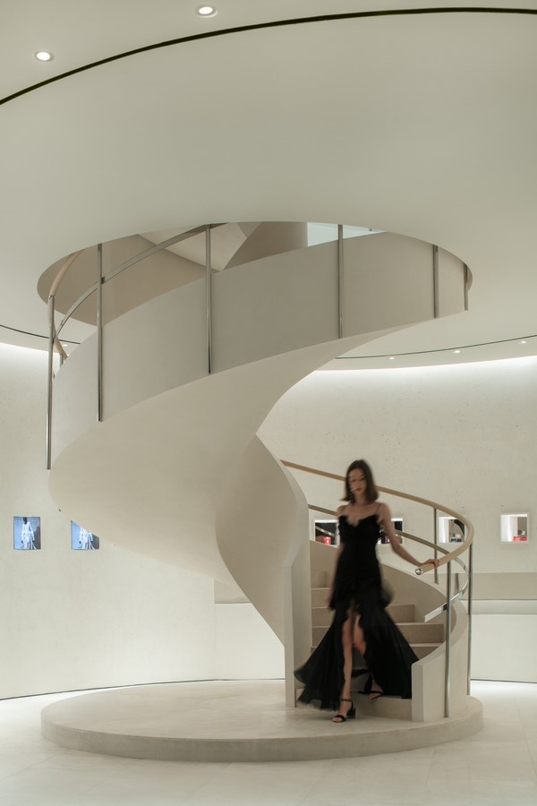
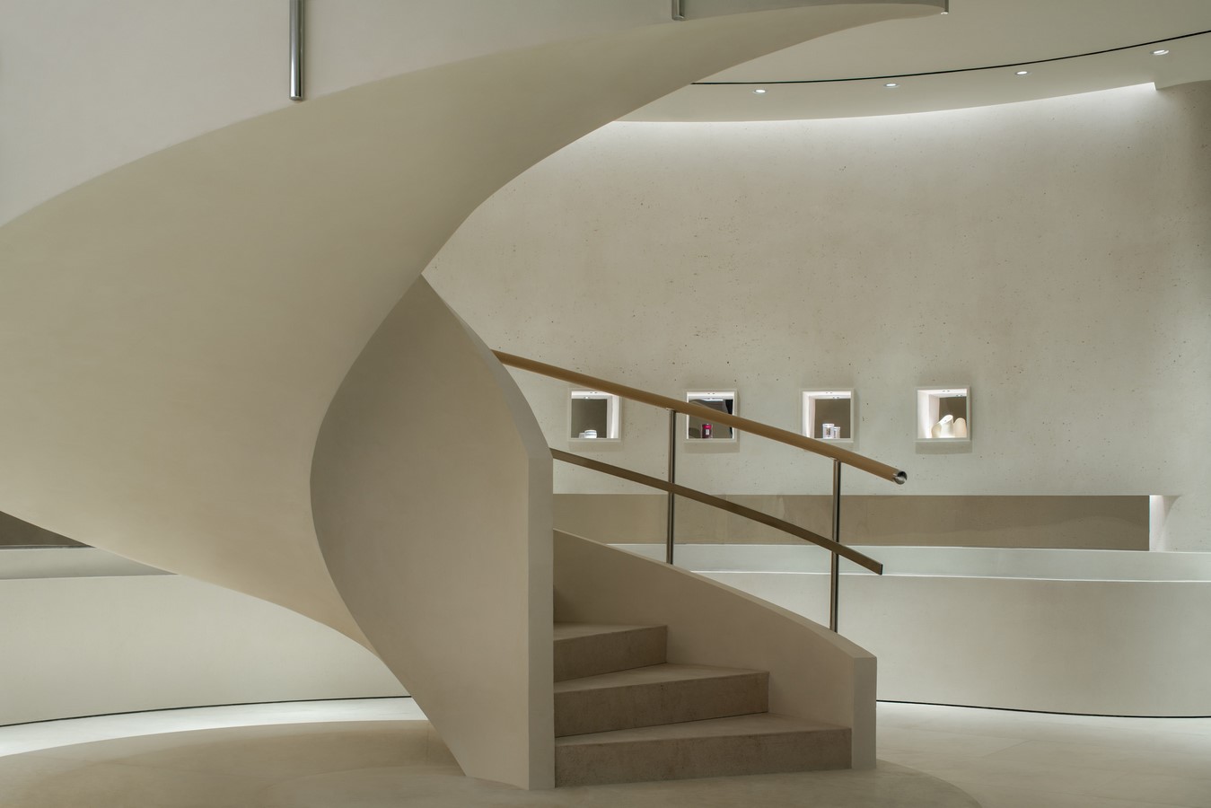
The revolving staircase that connects the first and second floors not only carries up and down functionally, but also becomes the spatial basis of the first floor as a coffee shop , gallery, and even a small art center by its softly beautiful shape.
The stone walls stand in a row, serving as a guiding line with the function of display. The lights are arranged in an orderly manner at the top, simulating mine operation. The combination of wall and lighting creates longitudinal extension, dividing the space and realizing a harmonious blend of movement and stillness.

Traveling between them, feeling the natural strain of the material, you can see contemporarily fashionable clothes, either hung or casually displayed against the wall. The installations that simulate real flowers growing freely on the rocks and mountains, offer vibrancy and vitality to the space.
Countless natural images are deconstructed and reconstructed here, which is an essential point to provide the space with function and beauty.
The independent VIP room greatly enhances the consumption experience of guests and also has the function of special display of high-end clothes. The design approach of continuing space unity in the same way as the fitting room is through the combination of materials and light, providing a comfortable place for guests to try clothes on and feel how costumes fit them.
Modern & Lifestyle
As the rotating staircase descends, the old artistic walls come into people’s vision. Surrounded by walls that seem to have gone through centuries, containing traces of time and history, visitors are connected to the 2nd floor in a sensory way.
When people step into the first floor, they can feel that the space satisfies the demand for presentation and display of the brand’s diverse contents and business sectors to the greatest extent.
At the same time, the overall spatial pattern is ring-shaped, and the rhythmic and enveloping nature of contours makes the space smooth and comfortable. So that, it won’t provide the visitors with monotonous experience. Instead, in the space, people can perceive the mix of exhibition and interpersonal communication.
Trends, art, design, and culinary experiences are distilled into the space, embracing everything and shaping people’s life.
“Fashion” becomes a “verb” here.


