Have you ever wondered what creates that compelling first impression when sending a thoroughly planned proposal to your potential clients or investors? Your submission will barely have a few seconds to make or break before the client moves on to another.
The burning question: How can you ensure your proposal goes unnoticed?
Now, put yourself in the shoes of a recruiter. Inundated with a sea of options flooding your inbox, each representing potential candidates vying for your attention, what truly captures your interest at first glance? Humans are visual creatures, biologically hardwired to engage and pay attention to great visuals. (Sanchez, 2023) To guarantee that your proposal does not vanish into the abyss, it is crucial to craft a striking image.

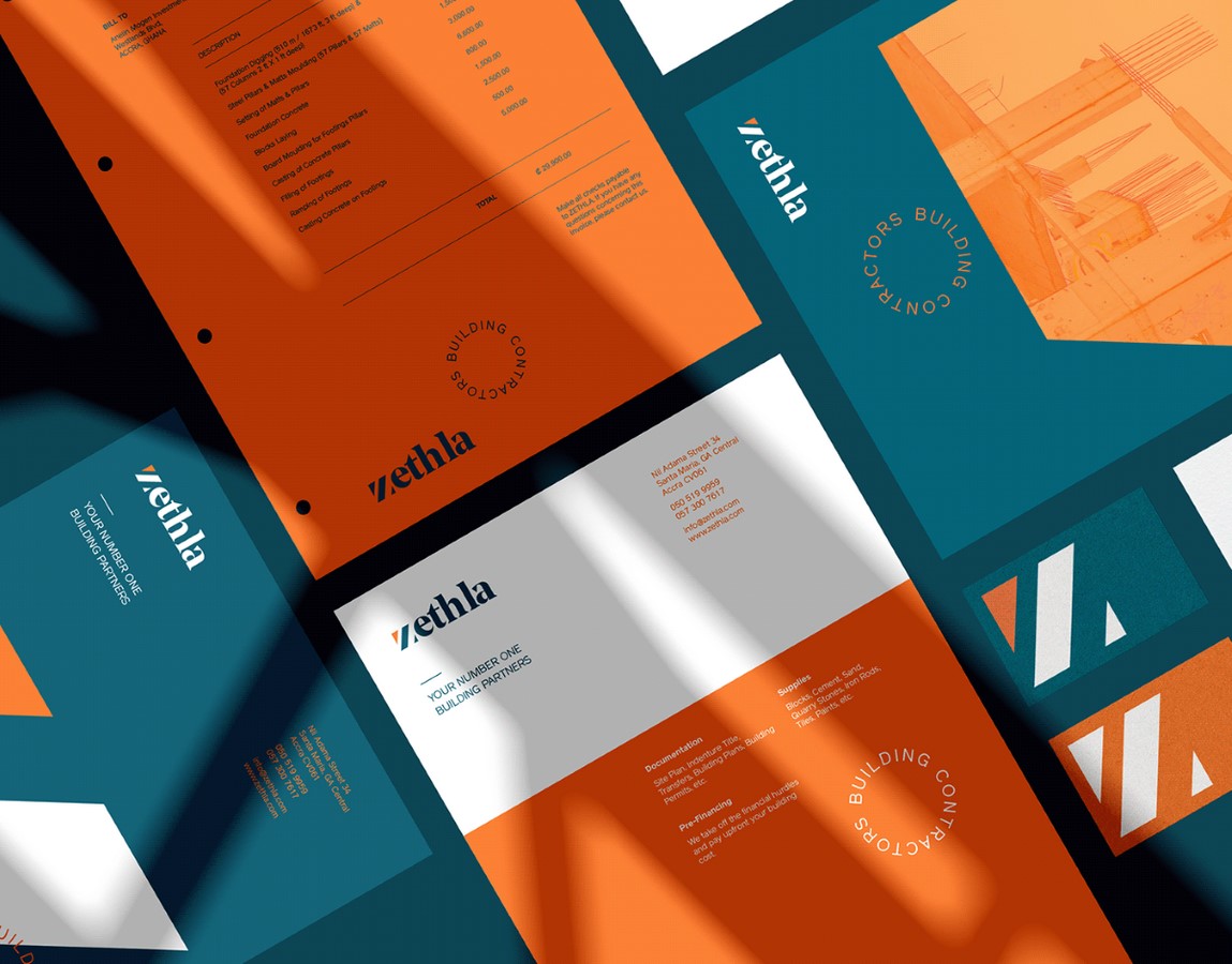
In the era of startups and social media, heavily influenced by visual aesthetics, every business demands well-crafted stationery regardless of scale. Stationery design encompasses the creation of both handwritten and printed media used for personal and professional correspondence. This includes business cards, letterheads, envelopes, packaging, and more. Business stationery design typically focuses on the company’s branding, while other forms allow more creative freedom and room for experimentation. (Tenekedjieva, 2020; Kosik, 2022)
In recent times, two design philosophies have gained prominence: minimalism and maximalism. Both these approaches are starkly different, each offering a distinct aesthetic. So, how does one determine which option best aligns with their brand, product, or business?
Exploring the Trend: Minimalistic Stationery Design
Minimalism, as suggested by Edward Strickland, “is a style distinguished by severity of means, clarity of form, and simplicity of structure and texture.” (Strickland, 2000) This transhistorical art movement has transformed significantly from its original forms and objectives, evolving into a ubiquitous concept extending far beyond art. “Minimalism may never have truly existed, but its influence is everywhere.” (Batchelor, 1997) From popular Netflix shows, like The Minimalists: Less Is Now, to best-selling books, like Marie Kondo’s The Life-Changing Magic of Tidying Up, minimalism has emerged as a trending buzzword recently, a mantra for simplicity. Over the years, this concept was employed across various design-related sectors, including graphic design and its counterpart, stationery design.

“Less is more”—This famous aphorism by architect Mies van der Rohe resonates with designers across diverse industries and essentially serves as a guide to all things minimalist.
Minimalistic stationery design embraces simplicity by utilizing basic geometric shapes, limited decoration, and abundant white space. (Meyer, 2000) It uses negative space, sparse typography, monchrome colors, and a strong sense of hierarchy. Designers strategically leverage negative and white spaces to emphasize essential elements and enhance message clarity. (McFarland, 2017; Tan, 2023) The fewer elements there are to bombard the viewer, the more likely they will focus on the text or image showcased. This approach has emerged as a safe bet for contemporary marketing campaigns as it conveys messages with minimal distractions. (NYFA, 2022; Doncas, 2023)
What is Maximalistic Stationery Design?
Minimalism, with its clean lines, muted colors, and modern look, has undeniably been a dominant force at play in recent times. While its simplicity was once refreshing, there is a growing sentiment that minimalism has become somewhat predictable and is starting to feel a tad bit mundane. Several brands are pivoting in the opposite direction to stand out in this rather saturated market. Enter: Maximalism. Embracing the big, bold, and beautiful, this art movement is often referred to as a “complex and eclectic modernity.” (Cuito & Asensio, 2002).

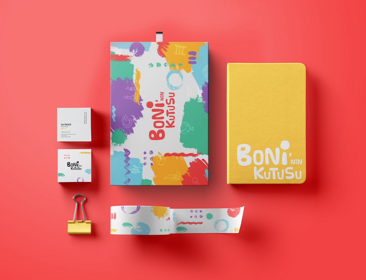
Maximalistic design is rooted in curated excess, layering varied elements, bold colors, patterns, and textures to create attention-grabbing, eclectic, or even eccentric designs. (Jacobsen, 2019; Tan, 2023) While the term implies an overwhelming complexity, it is essential to note that complexity exists across various forms of art and architecture, even in visually reductive minimalist designs. Hence, a more accurate description of this complexity is an extreme visual incoherence that blurs the recognition of individual elements, making it challenging to perceive a unified whole (Templeton, 2013)
Maximalistic stationery design is characterized by richness and a profusion of decorative patterns with minimal white space. (Rivers, 2004) Designers have adopted this style as a practical choice for brands looking to stand out from the constraints of conventional aesthetics. This approach portrays a sense of vibrancy, playfulness, energy, and excitement, especially enticing to younger generations. (Tan, 2023)
Navigating Design Choices
Each stationery type serves a distinct purpose; hence, their structuring and planning differ accordingly. Every stationery design project begins with the curation of a brand kit. This kit is your brand’s visual handbook, including logos, images, layouts, color schemes, and text guidelines. This visual consistency should extend to all stationery types used for your business marketing. The ideal design serves a dual purpose: effectively conveying essential information while authentically representing your brand. Choosing between a maximalistic or minimalist design depends on your company’s goals, values, and target audience. (Wiley, 2023)

Though minimalism and maximalism are contrasting schools of thought, they share a peculiar trait influencing how the recipient engages with the subject matter. In essence, both designs seek to evoke solid and immersive reactions, but they achieve this through contrasting methods. Minimalistic design is about keeping things simple and enabling a sense of focus by removing distractions. Maximalistic design, on the other hand, is the inundation of totalizing noise, which can be exciting but may also be overwhelming. (Templeton, 2013)
Striking a Balance: The Hybrid Approach
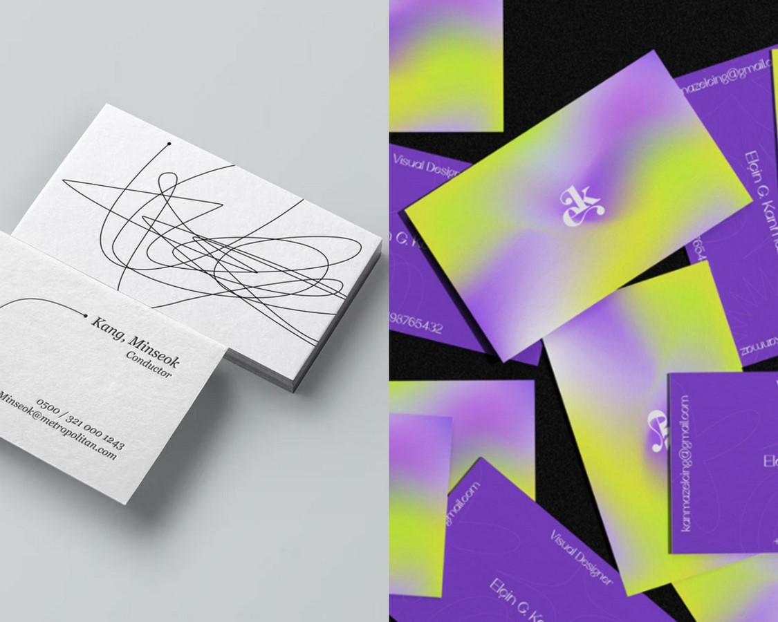
Design is an inherently subjective process. There are no rigid rules in stationery design; what works for one brand or individual may not work for another. The choice between minimalism and maximalism should align with the brand’s identity, values, and the message it intends to convey. Minimalism focuses on simplicity, clarity, and eliminating distractions, while maximalism embraces complexity, boldness, and vibrancy to stand out in a crowded market. In practice, the distinction between minimalism and maximalism is not always clear-cut. In fact, many designers choose to blend elements from both worlds. By doing so, they effectively convey multifaceted messages, appealing to a diverse audience. (Tan, 2023)
For instance, a business letterhead might adopt a minimalist style in its layout and typography. However, adopting maximalist elements in small, strategic ways, such as using bold and vibrant colors as accents or applying intricate patterns selectively to create focal points, can add depth and visual interest to an otherwise clean design. The key to this balancing act is to ensure that the maximalist elements enhance rather than detract from the overall stationery’s effectiveness.
Image 5_UWWWO Branding Identity and Visual Representation_©Reshma Mariam Mathew Behance
The Final Verdict
Minimalistic or maximalistic—There is no definitive winner in this debate. To determine which is the correct approach for you, it is essential to define your brand values and personality. The journey to finding the suitable style for stationery design involves exploration, understanding your target audience, and embracing the creative process. The most compelling and successful designs often emerge when design rules are stretched, mixed, and reimagined. Ultimately, the success of your stationery design lies in its ability to create a compelling first impression, engage your audience, and authentically represent your brand. Whether you lean towards minimalism, maximalism, or a blend of both, the key is to ensure that your design resonates with your goals and values.
References
Batchelor, D. (1997) Minimalism. London: Tate Gallery Publishing.
Cuito, A. and Asensio, P. (2002) Minimalism Maximalism. Barcelona: Loft.
Doncas, M. (2023) The Complete Guide to Minimalist Graphic Design, BeFunky. Available at: https://www.befunky.com/learn/the-complete-guide-to-minimalist-graphic-design/ (Accessed: 15 October 2023).
Jacobsen, L. (2019) ‘Lauren Jacobsen Interior design newsletter’, L Jacobsen Design, August. Available at: https://www.ljacobsendesign.com/wp-content/uploads/2019/08/August2019.pdf (Accessed: 10 October 2023).
Kosik, A.H. (2022) Letter perfect: How to be a stationery designer. Available at: https://www.skillshare.com/en/blog/letter-perfect-how-to-be-a-stationery-designer/ (Accessed: 15 October 2023).
McFarland, P. (2017) Minimalism: Not a passing trend, Emotive Brand. Available at: https://www.emotivebrand.com/minimalism/ (Accessed: 15 October 2023).
Meyer, J.S. (2010) Minimalism. London: Phaidon.
NYFA (2022) Mastering the art of minimalist graphic design, NYFA. Available at: https://www.nyfa.edu/student-resources/mastering-the-art-of-minimalist-graphic-design/ (Accessed: 15 October 2023).
Rivers, C. (2004) Maximalism: The Graphic Design of decadence and excess. Hove: RotoVision.
Sanchez, G. (2023) Why people love great visuals, based on science, Piktochart. Available at: https://piktochart.com/blog/why-people-love-great-visuals-science/ (Accessed: 15 October 2023).
Strickland, E. (2000) Minimalism: Origins. Bloomington, IN: Indiana University Press.
Tan, C. (2023) Minimalism vs Maximalism: Which is the better choice for your packaging. Available at: https://en.99designs.fr/blog/packaging-label/minimalism-vs-maximalism/ (Accessed: 15 October 2023).
Templeton, P. (2013) Defining Maximalism: Understanding Minimalism. Architecture Undergraduate Honors Theses. Available at: https://scholarworks.uark.edu/archuht/3/.
Tenekedjieva, S. (2020) How to get inspired to make creative stationery design, How to Get Inspired to Make Creative Stationery Design. Available at: https://www.manypixels.co/blog/print-design/stationery-design (Accessed: 15 October 2023).
Wiley, N. (2023) Stationery design 101: The best stationery design ideas, Printivity Insights. Available at: https://www.printivity.com/insights/2022/08/10/best-stationery-design/ (Accessed: 15 October 2023).


