About Mikou Studio
Selma Mikou and Salwa Mikou founded Mikou Design Studio in 2006, following many years of collaboration with international architecture firms, particularly Renzo Piano and Jean Nouvel, on projects involving large private and public buildings, residences, offices, and significant installations in public areas as part of the re-qualification of urban and harbour planning. Mikou Design Studio is a space for architectural experimentation and cross-disciplinary collaboration.

Mikou Studio has completed numerous outstanding projects, but these ten iconic works stand out.
Zero energy school
The Docks school in Saint Ouen is in a strategic urban location, in the heart of the Zac des Docks mixed-use development area, which is an example of sustainable urban development. It will be visible because of its roof, which is a key feature of the project and faces the openings of neighbouring buildings. It will be located in the middle of an urban complex comprised primarily of high-rise office buildings and housing.
The building’s location facilitated the orientation of all classrooms and playgrounds to take advantage of as much passive solar energy as possible. This spatial arrangement also increased the surface area required on the south for the photovoltaic panels that were integrated into the architecture of the covered playground areas.
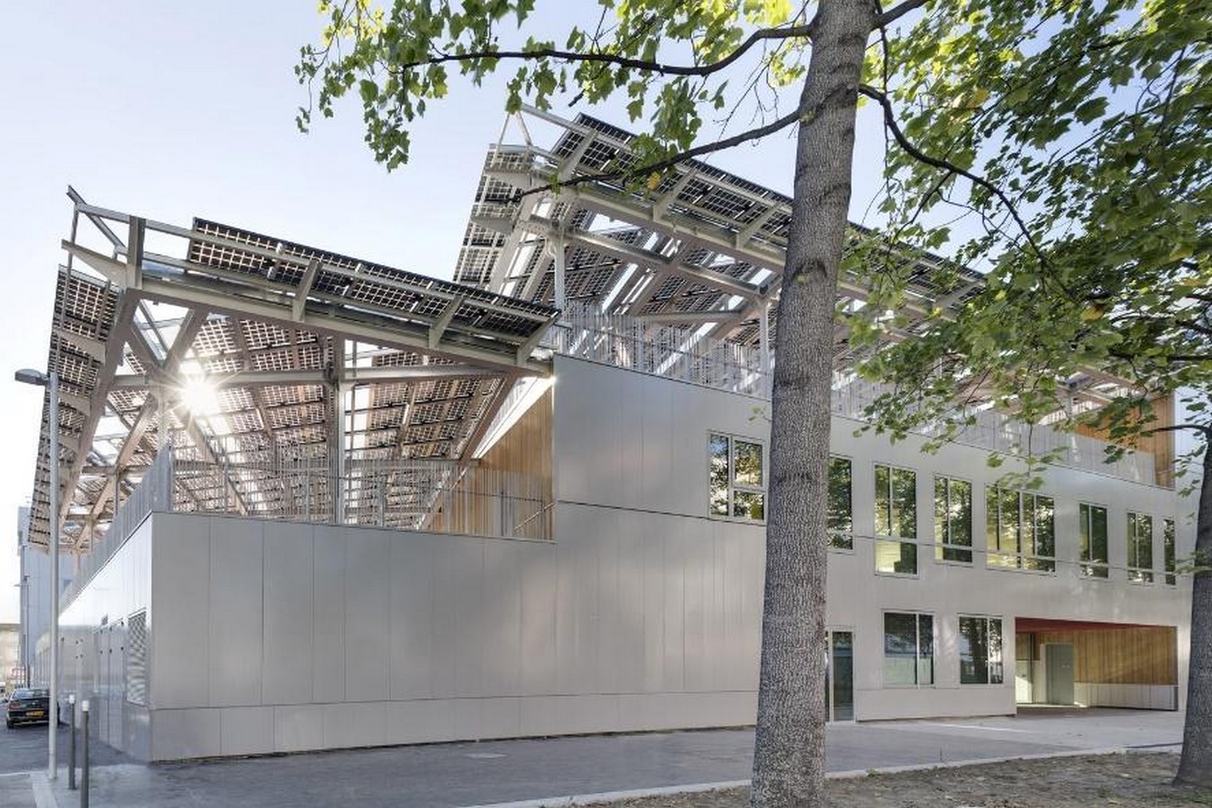
As a result, the scheme takes the form of a mass built-in stepped tiers on the east side of the main street, which is extended by large canopies and folds in crosswise strips on the diagonal of the site to face southwards. Internal gardens separate these stepped crosswise strips, opening wide east-west transparent views into the school while allowing clear identification of the various teaching areas open to the light and quiet on sheltered internal patios. The school is arranged in a series of gardens and volumes in brightly lit terraces that gradually descend to free the view and let in maximum sunlight.
Swimming Pool Feng Shui
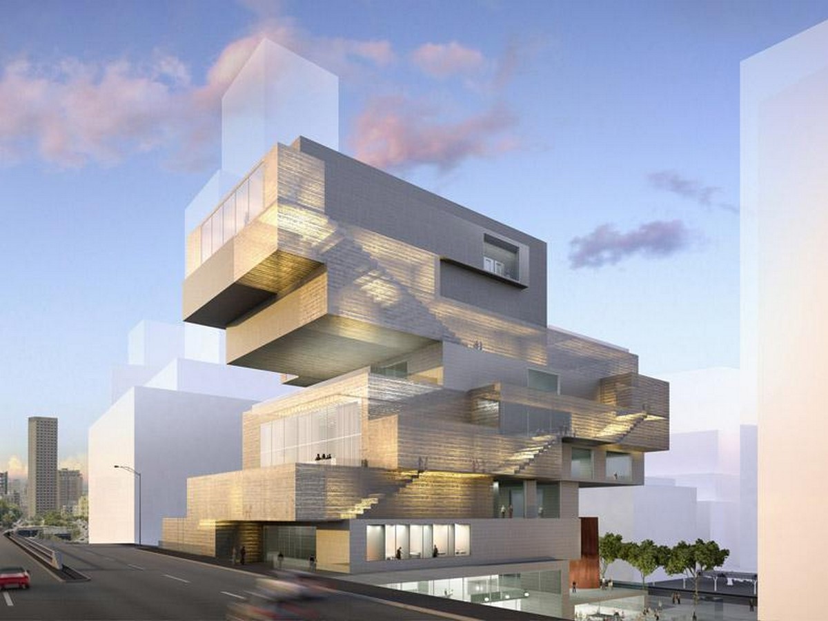
The proposal ‘Swimming Pool Feng Shui’ by Paris-based Mikou Design Studio was named the winning entry in a swimming pool competition in the French town of Issy Les Moulineaux.
Piscine du Fort was designed for practicing clarity, transparency, and architectural fluidity, with natural light defining the spatial experience. The programmatic elements are organised as sweeping curvilinear forms immersed within the project’s spatial continuum. The element composition creates porosity, allowing light to flood the interior while delineating distinct structural functions with strong individual identities. The façades, made of undulating golden wood, express the circular motions of water, alluding to energy circulation and centripetal flux. The building envelope has been worked and moulded to soften the linear effect of the volume and introduce variation in the form’s perception.
Place Florence
Florence Square is located in a strategic area of Fez’s new town. The square is defined by a main urban axis, a broad boulevard with a central island that generates significant pedestrian traffic. The remodelling of Florence Square in Fez aims to create a space for encounters and meetings on a pedestrian and neighbourhood scale, but also a place that is identifiable as a representative part of modern Fez. This symbolic location inspires and moves the people of Fez by evoking Florence.
It serves as a vehicle for cross-cultural dialogue and recalls the evolution of architectural forms. We were inspired to design the square by the octagonal form of the Baptistery of San Giovanni, a strong and symbolic figure in the Florentine urban landscape. It was critical to incorporate strong architectural elements into Florence Square to give it an urban presence while limiting its spatial expansion.
Lighthouse- Gateway to Rio de Janeiro
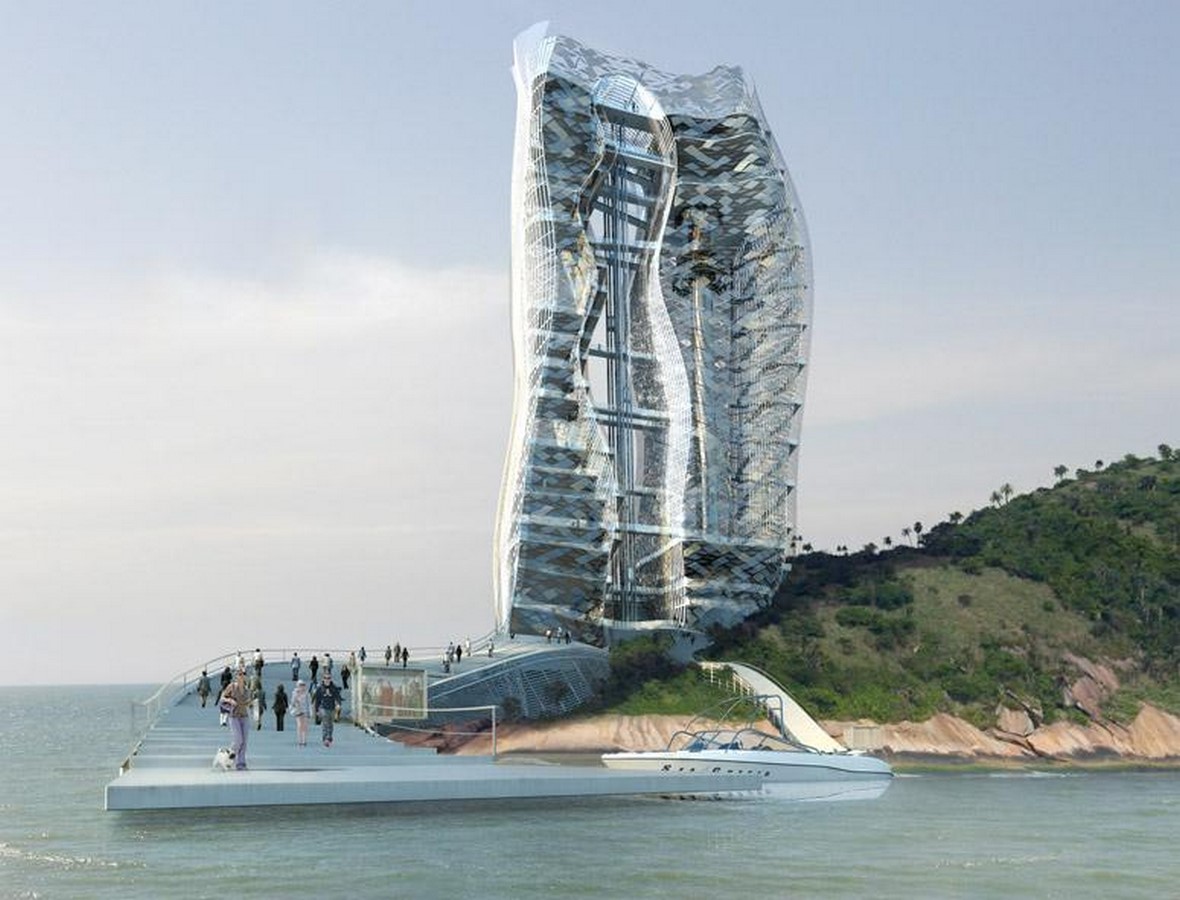
The Lighthouse skyscraper proposal demonstrates their ability to model urban, social, and human contexts in novel ways to create various types of living environments. The LED-lit tower is accessible via a large jetty and offers visitors a wide range of experiential destinations, including observation points, auditoriums, and skywalks, as well as a bungee facility, a climbing tower, and gyro drop, a cafeteria, urban balconies, and other multi-use spaces, and even a souvenir store.

The Lighthouse design’s aesthetics derive from the stark deformation of female curves and their re-contextualization into an abstract shape that will be distinctively illuminated at night. That feminine shape is cut out of the organic tower and serves as an opening, namely a Gate to Rio de Janeiro. Mikou Design Studio has thus very interestingly re-interpreted and re-appropriated the somewhat conventional function of the traditional lighthouse into a new Passage-like Lighthouse tower to bring a different kind of life to Cotunduba and Rio itself.
Arts Pavilion
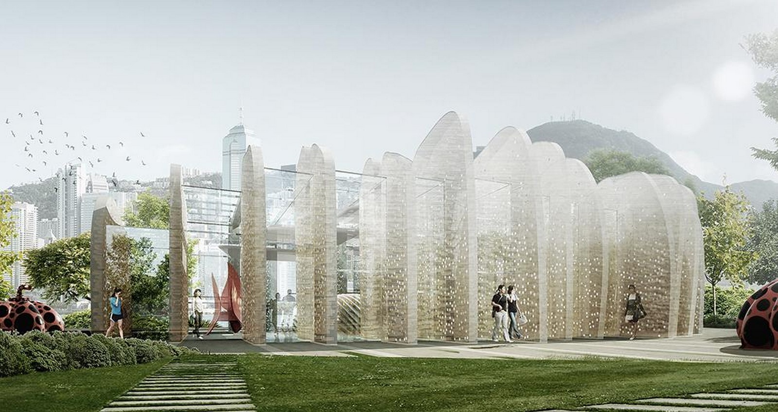
The pavilion comprises two parallel reinforced concrete walls perpendicular to the water’s edge. The plan arranges the walls in a roughly circular pattern to create a central inner space. The walls have an external elevation outline that is rounded to provide an overall shape reminiscent of Hong Kong’s rolling hills. This externally rounded outline shifts from one wall to the next, giving the pavilion the appearance of an undulating hill skyline.
These walls enclose a central space topped by a glass roof. Amorphic translucent forms in acrylic, resembling “clouds,” are suspended from the roof structure. The concrete walls’ external parts create an effect of interior/exterior fluidity, connecting the plaza entrance and the waterfront. The pavilion becomes an “in-between” structure, a meeting place for the hills and the water. Holes will be cast into the walls to lighten them visually. Lighting or glass inserts can be inserted into holes to create a poetic effect at night.
High School Jean Lurçat
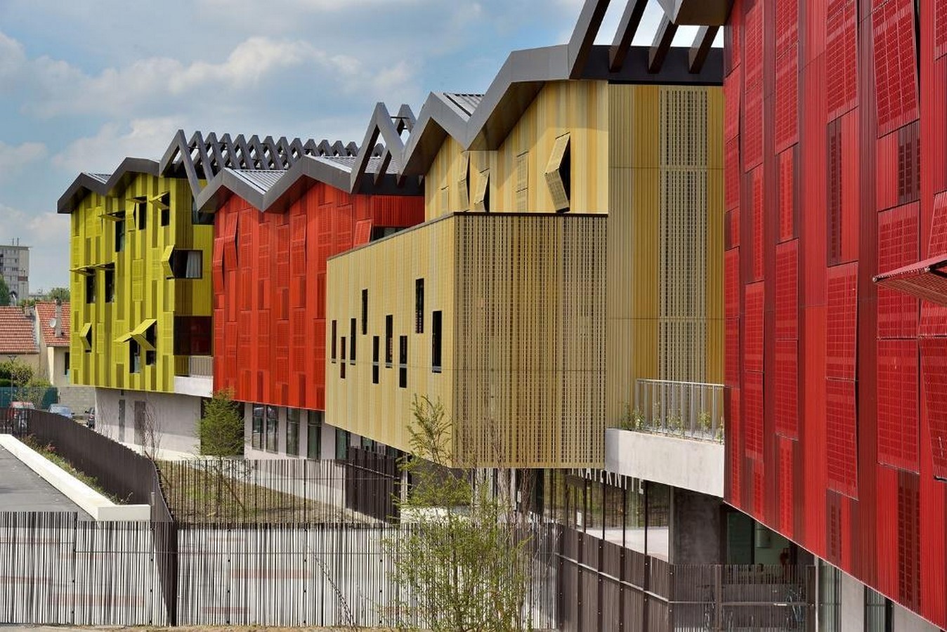
The metal roof pans adopt the same aesthetic as the blocks, with variations and rhythms in the folds of the roof elements creating coloured modulations on the facades. The undulating folded metal roof keeps the patios cool in summer and creates a microclimate in the terraced gardens. A delicately arranged series of separate but linked blocks in a park. Corner windows and lateral openings on the terraced gardens provide triple orientation for the blocks.
Between two blocks, a buffer area opens onto planted patios. The wall finish is corrugated stainless steel cladding that has been polished and perforated to various degrees. With an 8.5-meter cantilever, the lobby is completely glazed and opens onto both the playground and the forecourt. Access to the library is via an openwork staircase suspended in the ceiling. The glass roof atrium enlivens the circulations. The folded roof has glazed surfaces as well as metal panels. The interior’s materiality is made up of architectural concrete and timber cladding. Large windows that face each other create a dual orientation and are open to the outdoors. The gymnasium was designed as a separate block following the education blocks.
High School in Boulogne
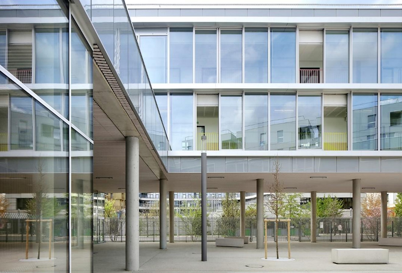
The school is designed as an open infrastructure on the Jules Guesde site – flexible, transparent, and adaptable to students and residents. The ground floor is opened up to the public by raising the building on columns to provide large openings onto the yard, as well as by providing shared meeting spaces that emphasise the building’s urban dimension: the lecture theatre, sports hall, and weight-training room are thus opened up to a broader public, while the pupils’ common room and restaurant animate the Jules Guesde/rue de Meudon crossing. The pivotal space of the project, articulating all of its functions, is the double-height hall between the front square and the yard.
The yard’s facades were sliding glass, allowing flexibility and managed natural ventilation for comfort in the summer, and are clad with enamelled glass panels. Facades facing the yard on the ground floor are designed to be opened and completely folded back to adapt to different uses and allow maximum openness and connection with the exterior. In addition to filtering and reducing light levels, Textile curtains contribute to the domestic comfort of the place, its identity, and how it is perceived, as much in its daily use as in its physical presence in the urban fabric. The generous provision of moving and meeting spaces on all floors and the exterior patios allows for broader ways of using the space and students’ appropriation of that informal space, both individually and collectively.
Balsaneo Aquatic Center
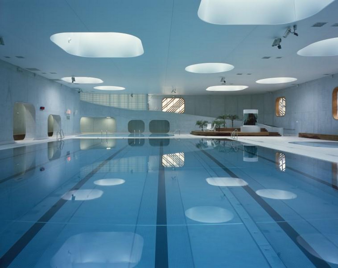
The building is revealed from the elevated forecourt as an ascending arabesque of volumes clad in thin metal slats that surround the pool hall and constitute its service spaces. A double-height reception hall that projects onto the volume of the pool hall distinguishes the fully glazed entrance. The project’s goal was to reveal the building’s structure in all forms by leaving the metal crossing beams visible, which are supported by large white concrete walls. The main interior materiality of the building is architectural concrete, which is clad in tiles and has large glass elements that project into the great landscape.
The pool hall is a spatial continuum that allows for privileged visual relations with the Indre Valley and transparencies between the pools, leisure areas, and the solarium. Using large edge-to-edge glass elements with no joinery creates a unified vision of the landscape without severing it. The zenithal light from the large portholes in the roof, combined with the large bays open to the landscape and sky, creates a very specific spatial and luminous atmosphere, allowing for intense changes in luminosity throughout the day. The large zenithal openings, which are rounded like glass carpets, allow for expansive sky views.
The building is developed on three levels: the lower ground floor hosts a multi-purpose room with a catering area, workout areas, association areas, and technical premises. The upper ground floor is the main level of the pool hall with the reception and entrance for the public. A balneotherapy centre with a pool of water jets, massaging showers, a hot marble area, a sauna, and a Hamman opens onto the outdoor solarium.
Bobigny school complex
The overall project is based on a three-level volumetric spiral. The grass-roofed structure houses a preschool and primary school, a recreation centre, a central kitchen, a toy library, a housing service, and parking. The school complex is located near the city hall in the middle of an urban complex primarily made up of housing. We designed this amenity, which represents the revitalisation of the city centre, to be a strong architectural landmark in its neighbourhood that is both welcoming and protective, turned inwards towards inner courtyards to ensure the children’s privacy.
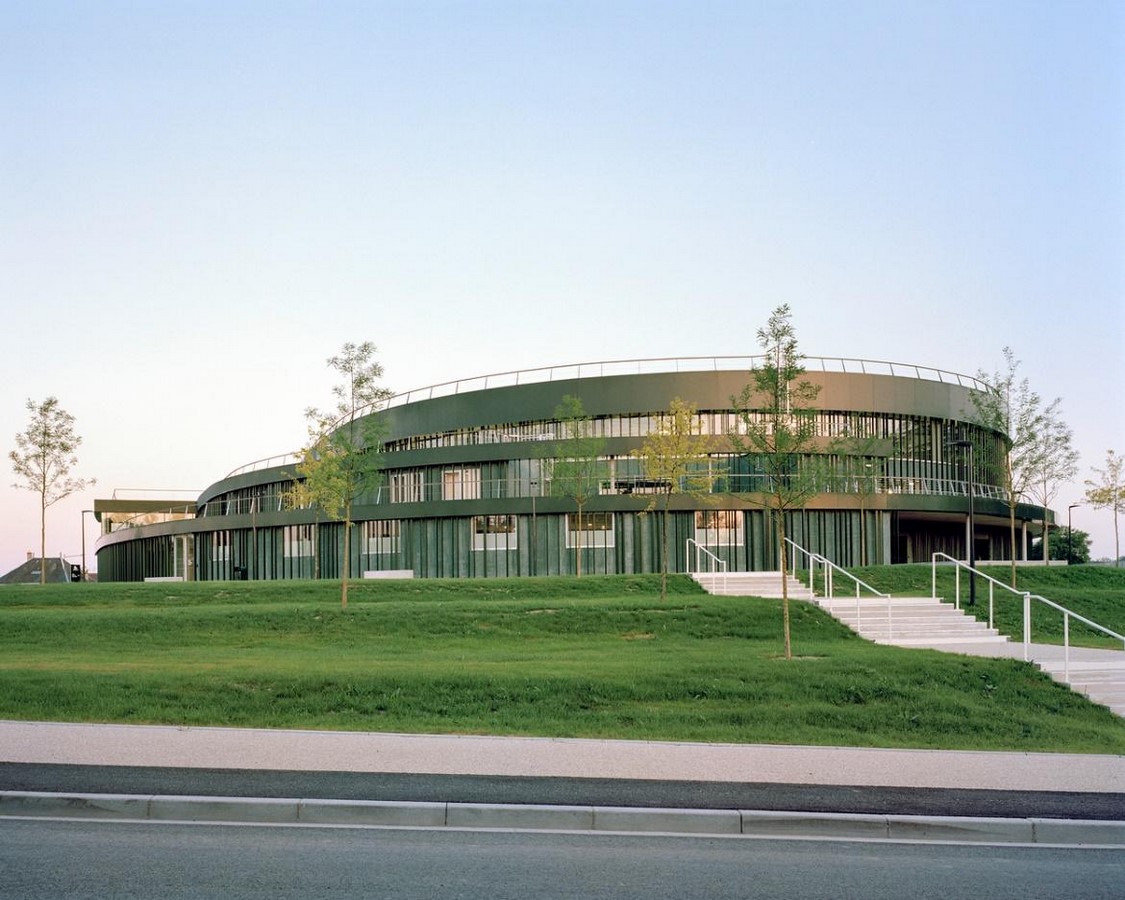
As a result, the scheme presents a two-story flat-facade wall building on the pedestrian street, enlivened by a random series of openings alternated with solid timber panels of various colours. Above, the building appears as a series of planted terraces that open up and wrap around the void of the nursery school playground on the ground floor. Natural timber panels alternate with timber-framed glazed panels on a horizontal grid to form the external façades.
House of Arts and Culture
Like Beirut, the House of Arts and Culture is inspired by diverse cultures, stimulating the imagination by integrating the sensitivities of various artistic domains. This overlapping of cultural layers is a defining feature of the program, which refers to the iconic image of Beirut, a city of cultural and historic sedimentation nicknamed the “well” due to the various Hellenistic, Roman, Arabic, and Ottoman layers.

The building is not conceived as a monolithic mass; it attempts to stage these overlapping cultural functions and value the processes and circulations within the building, which serve as transitional spaces for exchange and creative intertwining.


